Statistics
A number says where you are. A chart says how you got there and where the line is going. Four tabs, all of them drawn from readings you have already paid for and transcripts already on your disk — no extra API calls.
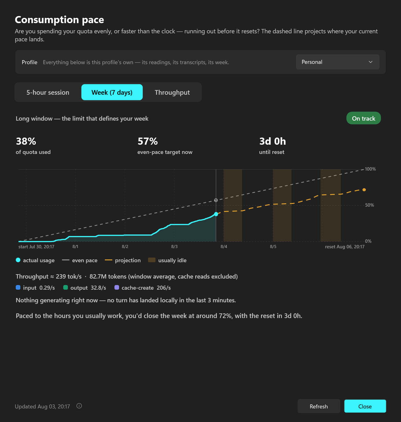
The two window tabs
The 5-hour session and the 7-day week, each as a burn-up chart: your real utilization against the even-pace line, with a dashed projection of where your current pace lands, and its own verdict chip. Last week's burn-up sits behind this week's as a faint line on the same axes, so “worse than last week?” is a glance rather than a memory test.
Past the included quota
The clay extra-usage line is drawn on a right-hand scale of its own and never mixed into the 0–100%: an allowance with its own limit and its own reset is not the same quantity as the quota included in your plan. When the API says you are over but never says by how much, the chart shades the stretch instead and names no figure. Being over is a fact about the account rather than about one window, so both tabs draw it.
Throughput — what is running this minute
- ✓Two three-minute charts of the rolling rate sampled once a second, each ceiling ruled and labelled in tok/s.
- ✓The upper chart is one line per repo — the heaviest four, direct-labelled with their own rates, the rest as one grey “others”; each keeps its colour while it is on screen, so nothing changes hands mid-read.
- ✓The lower chart splits the same rate by token type, which is where the cost of the cache re-read per turn becomes visible.
- ✓It scrolls because the axis is time — the motion is the data, not a spinner. A line slides down through a pause because the work really is ageing out of the 60-second window. Idle goes flat, and it only repaints while the window is on screen.
Sessions — where it actually went
One row per conversation instead of a total, named by the title Claude Code gave it under the project it ran in. A workflow's agents fold into the session that spawned them, so a fan-out is one row and not twelve; open a row and it unfolds into the tasks that produced it, each with its own cost beside its subtree's — which is how you tell a cheap coordinator from an expensive fleet. Below the list, which kind of work ate the range: one row per task kind and per named slash command, with the effort its calls ran at, because the expensive command and the cheap prompt land in the same repo.
The dollar column is not a bill
The last column reads ≈ $ at list prices: what those tokens come to at Anthropic's published API rate card, priced per model and summed, so a $2 conversation and a $40 one stop looking alike. A subscription exposes no dollar balance and the tray knows nothing about your plan, your seat or your invoice — the ⓘ beside the range picker says exactly that, along with the date the rates were read. It reports what ran and never suggests running cheaper.