← Back to the overview
Observability
The projection
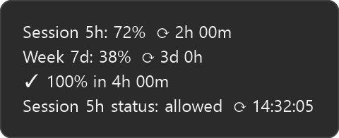
A percentage tells you where you are. It does not tell you whether you are going to make it. The tray runs two different forecasts, because the two rate-limit windows behave differently — and the icon's colour is the answer, so you get it without opening anything.
Two windows, two models
- ✓The 7-day week uses a proportional pace line: your usage against the share an even burn would have spent by now. It is accurate from the very first reading, because it needs no history — only the clock.
- ✓The 5h session uses least-squares regression on a short rolling history of your utilization. A five-hour window is too short for an even-pace assumption to mean anything: what matters is the slope of the last few readings.
- ✓The weekly projection then steps around the hours you actually work — flat overnight and at weekends, climbing while you are at the keyboard — so “you run out here” lands mid-afternoon rather than at 4 a.m. It needs a few weeks of history; until then it is the plain average-pace line.
Four states, and clay is not red
- ✓On track — at your current pace, usage stays under 100% until the window resets. The fill bar stays blue.
- ✓Danger — at your current pace, usage hits 100% before the reset. The bar turns vivid red while there is still time to ease off.
- ✓Extra usage is paying — you are past your included quota and still working. The bar turns clay, because red means stopped and clay means this is costing money. The tooltip says since when, and the number reports the extra-usage allowance on its own scale rather than the 0–100% of a quota the account no longer has.
- ✓Blocked — a window is spent and nothing is paying past it. It stays blocked on the window that still has room: a week at 47% behind a spent session wears the red chip and says so in words. The tooltip deliberately gives no percentage and no window name there, because naming Week 7d would caption the wrong number.
Where the colour is
The percentage is drawn as a vector at the exact size the tray requests, so it stays sharp at 125–200%. Its colour is the window it is about — white for the session, yellow for the week, and orange whenever extra usage is paying, which is the one signal on the tile that still works when 0 left leaves no fill bar to carry it. The fill itself is the forecast.